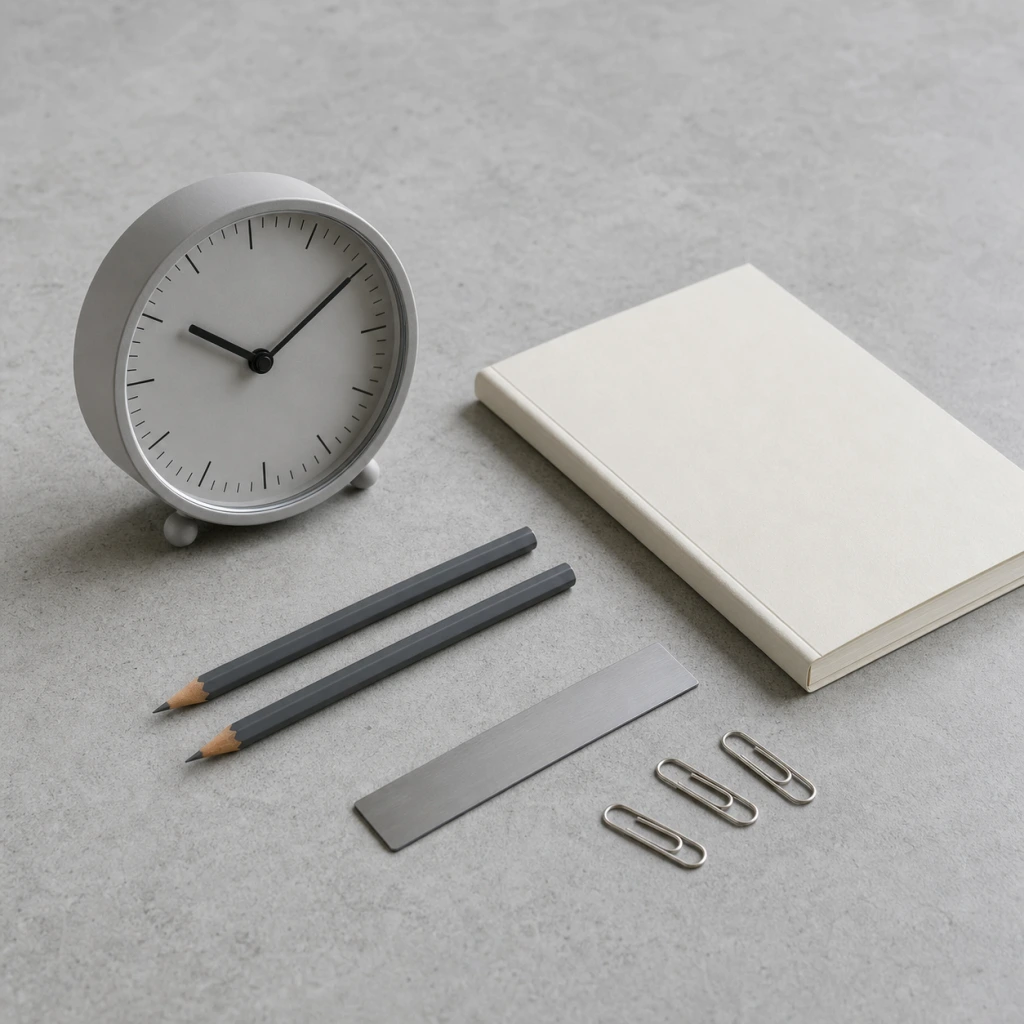
Analog Clock and Stationery on Concrete in Soft Window Light
AI generated
Use case: product-mockup
Asset type: square marketplace workspace photography
Primary request: Create a photorealistic, meticulously organized still-life workspace photograph featuring one generic unbranded analog desk clock and a restrained set of stationery on a concrete worktop.
Scene/backdrop: cool light-gray fine-textured concrete tabletop, clean and uncluttered, with no room interior visible.
Subject: a simple round analog desk clock with a matte pale-gray face, plain black tick marks without numerals, slim black hands, and no logo; beside it, one closed off-white notebook with no writing, two graphite-gray pencils with blank barrels, a small matte-silver ruler with no markings, and three plain paper clips.
Style/medium: professional product photography, commercial studio lighting discipline using natural window light; sharp focus on the product, clean edges; accurate material rendering, realistic reflections; photorealistic, high detail.
Composition/framing: square 1:1 frame, close tabletop detail photographed with a 100mm macro lens from a shallow 35-degree angle. Arrange the clock and stationery on a precise diagonal grid with generous consistent gaps. Each object has its own clear footprint and shadow; no overlapping objects or overlapping shadows. Preserve deliberate negative space around the group, especially along the upper and right edges. Minimal, orderly composition.
Lighting/mood: one large window off to one side provides soft natural daylight, broad enough to create short, low-contrast shadows that remain separate. Gentle cool fill from the concrete surface, controlled highlights on the clock rim and paper clips, no harsh specular glare.
Color palette: cool concrete gray, pale gray, graphite, matte silver, and off-white; quiet tonal separation so every object remains clearly distinct from the background.
Materials/textures: fine concrete pores, matte paper fibers, lacquered wood pencil texture, softly brushed metal, clear clock glass with subtle realistic reflection.
Depth of field: place the focus plane across the clock face, front notebook edge, and nearest pencil details; allow only the farthest paper clips and distant concrete texture to fall into a gentle natural blur, while the main products remain legible and crisp.
Constraints: no people, no hands, no electronics, no cables, no branding, no trademarks, no readable words, no letters, no numerals, no logos, no engraving, no watermark. Maintain physically consistent object shapes, scale, perspective, and shadow direction.
Avoid: distorted clock geometry, warped stationery, duplicate objects, merged objects, random text, illegible pseudo-labels, mismatched shadows, overlapping shadows, excessive HDR, dramatic darkness, clutter.
✓ The prompt that made this image
차가운 연회색 콘크리트 상판 위에 상표가 없는 아날로그 탁상시계와 절제된 문구류를 정돈한 사실적인 워크스페이스 정물 사진. 숫자와 로고가 없는 무광 연회색 시계, 글자가 없는 오프화이트 노트, 흑연색 연필 두 자루, 눈금 없는 무광 실버 자, 종이 클립 세 개를 배치한다. 100mm 매크로 렌즈로 낮은 35도 각도에서 근접 촬영하며, 소품을 일정한 간격의 대각선 격자로 정렬해 각각의 자리와 그림자가 겹치지 않게 한다. 프레임 위쪽과 오른쪽에 넉넉한 여백을 둔다. 한쪽의 큰 창에서 들어오는 부드러운 자연광이 짧고 대비가 낮은 그림자를 만들고, 콘크리트의 차가운 반사광이 시계 테두리와 금속 클립의 윤곽을 살린다. 초점면은 시계판, 노트 앞 모서리, 가까운 연필 디테일에 두고 가장 먼 클립과 콘크리트 질감만 자연스럽게 흐린다. 전문 제품 사진, 상업 스튜디오 조명 수준, 선명한 제품 초점과 깨끗한 가장자리, 정확한 재질 표현과 사실적인 반사, 포토리얼리스틱, 고해상도 디테일. 사람과 손, 전자기기, 케이블, 상표, 로고, 읽을 수 있는 글자와 숫자, 각인, 워터마크가 없다.⚠ Korean translation — results will differ
Why it's written this way
The phrase "broad enough to create short, low-contrast shadows that remain separate" reconciles side window light with a multi-object arrangement. Without that broad source and the instruction that every object owns its shadow, the pencils, ruler, and clips would cast long crossing lines that make the surface look untidy.
"A precise diagonal grid with generous consistent gaps" is the organizing rule. The diagonal keeps the close macro view active, while the repeated gaps prevent the clock, notebook, and smaller tools from collapsing into one visual mass. Reserving the upper and right edges as negative space gives the arrangement a clean boundary instead of filling every available area.
The palette clause limits the props to pale gray, graphite, matte silver, and off-white. Those cool restrained tones belong to the concrete rather than fighting it, but the lighter clock face and notebook still separate from the worktop. Removing that tonal separation would let gray accessories disappear into the concrete.
The focus instruction places the usable sharpness across the clock face, notebook edge, and nearest pencils rather than on a single decorative point. The farthest clips and distant concrete are allowed to soften, which gives a 100mm macro image depth without sacrificing the defining details of the main objects.
Try a variation
No variations yet