Concrete Desk Stationery in Soft Window Light
AI generated
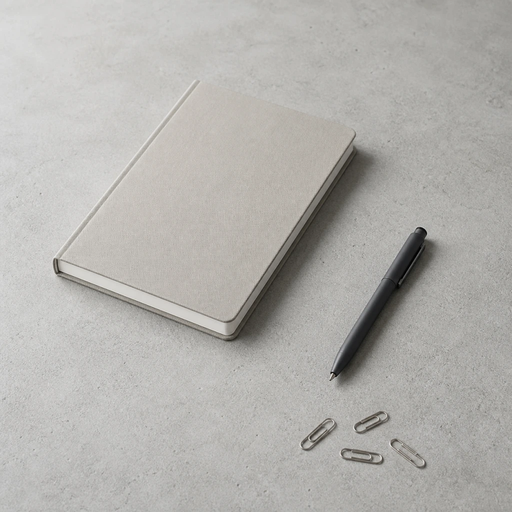
A photorealistic, meticulously organized stationery still life featuring one closed unbranded notebook, one simple unbranded pen, and a small restrained group of plain metal paper clips on a cool light-gray concrete tabletop with fine realistic mineral texture and no other objects. Square composition photographed at a 45-degree angle from a seated person's natural eye line, not top-down. The notebook, pen, and clips follow a clean diagonal grid with generous, deliberate negative space between every object; every item is fully visible and separated. Soft natural window light enters from one side, broad and gently diffused, creating subtle consistent shadows that fall in the same direction and never overlap. A pale warm-gray notebook and dark slate pen remain clearly separated from the light concrete background. Moderate-deep depth of field keeps all three subject groups sharply focused while only the farthest tabletop texture softens very slightly. Professional product photography, commercial studio lighting, sharp focus on the product, clean edges, accurate material rendering, realistic reflections, photorealistic, high detail. No people, no hands, no body parts, no electronics, no cables, no branding, no logos, no readable text, no engraving, no watermark, no distorted objects, no mismatched shadows, no harsh HDR.
✓ The prompt that made this image
고운 광물 질감이 사실적으로 드러나는 차가운 라이트 그레이 콘크리트 상판 위에 무지 노트 한 권, 단순한 무지 펜 한 자루, 평범한 금속 클립 몇 개만 정돈해 놓은 사실적인 문구 스틸라이프. 앉은 사람의 자연스러운 시선 높이에서 45도 각도로 촬영한 정사각 구도이며 탑다운이 아니다. 노트, 펜, 클립을 깔끔한 대각선 격자에 맞추고 각 물건 사이에 의도적인 여백을 넉넉히 두어 모든 물건이 잘리지 않고 서로 분리되어 보인다. 한쪽 창에서 들어오는 넓고 부드럽게 확산된 자연광이 모든 그림자를 같은 방향으로 은은하게 만들며 그림자는 서로 겹치지 않는다. 옅은 웜그레이 노트와 짙은 슬레이트색 펜이 밝은 콘크리트 배경에서 뚜렷하게 분리된다. 중간보다 깊은 심도로 세 종류의 피사체를 모두 선명하게 유지하고 가장 먼 상판 질감만 아주 약하게 흐린다. 전문 제품 사진, 상업용 스튜디오 조명, 제품에 선명한 초점과 깨끗한 가장자리, 정확한 소재 표현과 사실적인 반사, 사실적이고 높은 디테일. 사람, 손, 신체 일부, 전자기기, 케이블, 브랜드, 로고, 읽을 수 있는 글자, 각인, 워터마크, 왜곡된 물체, 어긋난 그림자, 과도한 HDR은 없다.⚠ Korean translation — results will differ
Why it's written this way
The phrase "broad and gently diffused" is the load-bearing lighting instruction. A small or hard side source would give the notebook, pen, and four clips separate high-contrast shadows that compete and overlap; broad diffusion keeps their direction consistent and their edges quiet. "A clean diagonal grid with generous, deliberate negative space" prevents the generator from treating the clips as filler and scattering them randomly. The open concrete at the upper right and between the three object groups is part of the composition, not unused area. The cool light-gray slab sets the palette, while the warm-gray notebook and slate pen add restrained contrast without fighting the mineral surface; removing that color relationship could make a dark object disappear or a bright prop feel pasted on. Finally, "moderate-deep depth of field" keeps the notebook, pen, and clips equally useful as subjects. Only the far tabletop texture is allowed to soften, because shallow focus on the foreground clips would make the notebook look incidental rather than part of one ordered set.
Try a variation
No variations yet