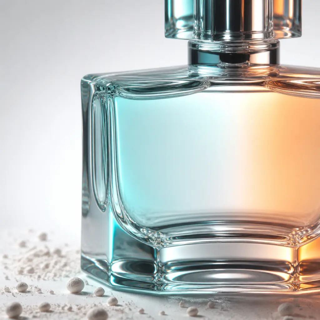
Clear Perfume Bottle with Teal and Orange Refraction
AI generated
An extreme close-up photorealistic commercial photograph of an unbranded clear geometric glass perfume bottle with visible transparency, thick refractive edges, a plain cap, and no label or lettering. Only part of the bottle deliberately fills the square frame, while its shoulder, edge, and heavy glass base remain readable in a crisp macro focal plane. A luminous background falls from light gray to white, with a restrained scatter of fine pale mineral powder and tiny neutral granules around the base. Teal gel light from one side and orange gel light from the other create a precise color boundary across the glass surface; back-edge illumination defines the transparent contour and controlled studio flags prevent washed-out front light. Professional product photography, commercial studio lighting, sharp focus on the product, clean edges, accurate material rendering, realistic reflections, photorealistic, high detail. Premium ecommerce detail image with no people, no hands, no logos, no trademarks, no readable text, no label, no watermark, no distorted bottle geometry, no floating granules, no excessive HDR.
✓ The prompt that made this image
브랜드가 없는 투명한 기하학적 유리 향수병을 극단적으로 가까이 촬영한 사실적인 상업 사진. 두꺼운 굴절 가장자리와 투명도가 보이며 뚜껑은 단순하고 라벨과 글자는 없다. 병의 일부가 의도적으로 정사각 프레임을 채우지만 어깨선, 가장자리, 두꺼운 유리 바닥은 선명한 매크로 초점면에서 읽힌다. 밝은 회색에서 흰색으로 이어지는 배경 위에 옅은 광물 가루와 작은 중성색 알갱이가 절제되어 흩어져 있다. 한쪽의 청록 젤 조명과 반대쪽의 주황 젤 조명이 유리 표면에 정확한 색 경계를 만들며, 뒤쪽 가장자리 조명이 투명한 윤곽을 살리고 플래그가 정면광에 의한 형태 소실을 막는다. 전문 제품 사진, 상업 스튜디오 조명, 제품에 선명한 초점과 깨끗한 가장자리, 정확한 재질 표현과 사실적인 반사, 사실적이고 세밀한 묘사. 사람과 손, 로고, 상표, 읽을 수 있는 글자, 라벨, 워터마크, 왜곡된 병, 떠 있는 알갱이, 과도한 HDR 없음.⚠ Korean translation — results will differ
Why it's written this way
"Back-edge illumination defines the transparent contour" is the load-bearing instruction. Clear glass under frontal light alone loses its perimeter against a pale background and reads as an empty patch; lighting the edge gives the viewer a shape to follow. The teal and orange sources are placed on opposing sides so their boundary bends with the glass instead of becoming a flat color overlay. Keeping the gray-to-white gradient slightly darker near one edge adds separation without making the bottle look smoky. The macro crop is intentional, but naming the shoulder, edge, and heavy base prevents an abstract crop that no longer communicates the product.
Try a variation
No variations yet