Wine Bottle and Glass Levitation with Dual Gels
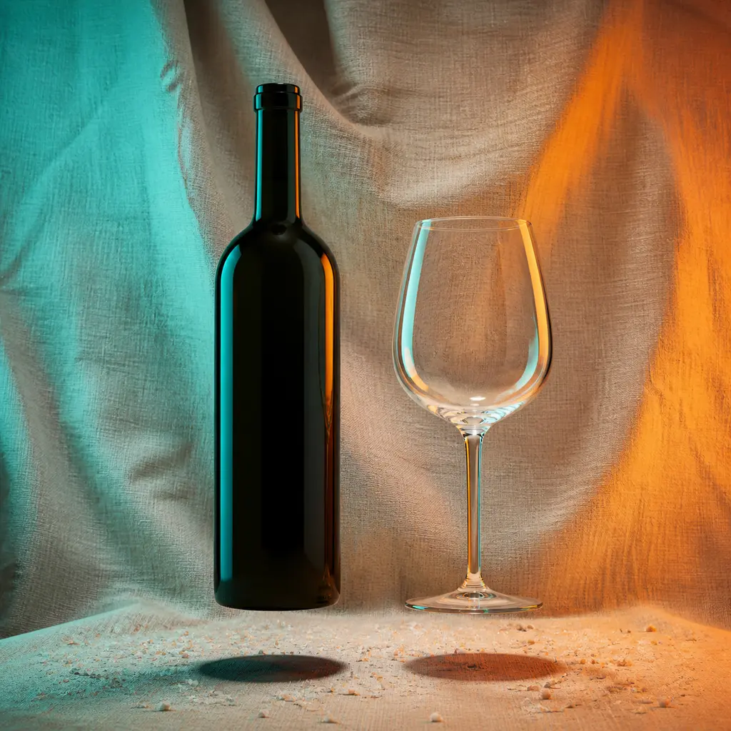
AI generated
Use case: product-mockup
Asset type: square ecommerce campaign product image
Primary request: A photorealistic commercial still life of one unbranded dark green wine bottle and one clear stemmed wine glass, shown together. Both products are suspended just a few centimeters above the surface in a controlled levitation shot, with their correctly aligned shadows directly beneath them. A restrained scattering of pale mineral grains surrounds the shadow area.
Scene/backdrop: softly crumpled natural beige linen cloth with broad gentle folds, bright enough to separate the dark bottle silhouette.
Composition/framing: complete bottle and complete glass fully visible, clean balanced square composition, realistic scale and upright orientation.
Lighting/mood: two controlled colored gel lights from opposite sides, teal from one side and warm orange from the other; distinct teal-orange color boundaries travel across both dark glass and transparent glass. Narrow edge highlights define every glass contour; neutral low fill keeps the label-free bottle readable.
Materials/textures: accurate dark translucent glass, clear glass, realistic colored reflections and refraction, dry linen, fine scattered mineral grains.
Constraints: professional product photography, commercial studio lighting; sharp focus on the product, clean edges; accurate material rendering, realistic reflections; photorealistic, high detail. Square composition. Bottle has no label. No logo, no trademark, no readable text, no people, no hands.
Avoid: liquid splashes, distorted bottle, warped glass stem, extra vessels, floating shadow disconnected from products, excessive HDR, watermark, text, clutter.
✓ The prompt that made this image
무브랜드 짙은 초록 와인병 하나와 투명한 스템 와인잔 하나를 함께 담은 포토리얼 상업용 정물 사진. 두 제품은 표면에서 몇 센티미터 떠 있으며 그림자는 바로 아래 정확히 정렬된다. 그림자 주변에는 옅은 광물 알갱이를 절제해 흩뿌린다. 넓고 부드러운 주름의 천연 베이지 리넨 배경은 짙은 병의 실루엣을 분리할 만큼 밝다. 청록과 따뜻한 주황 젤 조명을 양쪽에서 비춰 두 유리 표면에 명확한 색 경계를 만들고, 가느다란 엣지 하이라이트가 모든 윤곽을 살린다. 중성의 약한 보조광이 라벨 없는 병을 읽히게 한다. 전문 제품 사진, 상업용 스튜디오 조명, 선명한 초점, 깨끗한 가장자리, 정확한 재질과 사실적인 반사, 포토리얼, 고해상도 디테일. 로고, 상표, 글자, 사람, 손 없음.⚠ Korean translation — results will differ
Why it's written this way
"Narrow edge highlights define every glass contour" is essential because front light would disappear into the clear glass and leave only a vague interior reflection. The opposing teal and orange sources make their own shapes visible as separate color boundaries, allowing the dark bottle and clear bowl to remain distinct materials. A neutral low fill prevents the bottle's center from collapsing into featureless black. The phrase "correctly aligned shadows directly beneath them" sells the levitation: if either shadow shifts away from its object, the composite immediately reads as a cutout rather than a controlled studio suspension.
Try a variation
No variations yet