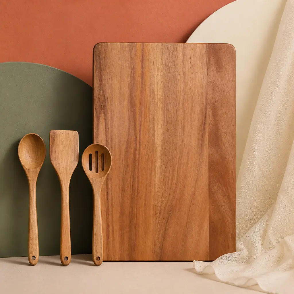
Wood Cutting Board and Utensils with Raking Side Light
AI generated
A photorealistic commercial product photograph of an unbranded solid wood cutting board with three coordinated wooden cooking utensils, emphasizing matte natural grain. The products stand against layered low-saturation terracotta, sage, and cream seamless paper planes, with a narrow drape of sheer lightweight silk-like fabric entering the composition without obscuring them. Shot with a 50mm lens as an eye-level straight-on hero image, centered and balanced with generous margins and the full product silhouettes immediately readable. Controlled side light rakes across the wood grain, while a white reflector on the opposite side opens the shadows without removing their depth; soft contact shadows ground every object. Professional product photography, commercial studio lighting, sharp focus on the product, clean edges, accurate material rendering, realistic reflections, photorealistic, high detail. Square ecommerce composition, no people, no hands, no logos, no trademarks, no readable text, no watermark, no duplicated utensils, no warped shapes, no floating objects, no mismatched shadows, no excessive HDR.
✓ The prompt that made this image
브랜드가 없는 원목 도마와 나무 조리도구 세 개를 촬영한 사실적인 상업 제품 사진. 무광 천연 목재의 결을 강조한다. 제품은 채도를 낮춘 테라코타, 세이지, 크림색 심리스 페이퍼 면 앞에 세우고, 제품을 가리지 않는 얇고 비치는 천을 가장자리에 드리운다. 50mm 렌즈로 눈높이 정면에서 촬영한 균형 잡힌 히어로 컷이며 제품 전체의 외곽선이 즉시 읽힌다. 측광이 나뭇결을 비스듬히 훑고 반대편 흰색 반사판이 입체감을 유지하면서 그림자를 연다. 부드러운 접지 그림자가 모든 물체를 바닥에 앉힌다. 전문 제품 사진, 상업 스튜디오 조명, 제품에 선명한 초점과 깨끗한 가장자리, 정확한 재질 표현과 사실적인 반사, 사실적이고 세밀한 묘사. 정사각 이커머스 구도, 사람과 손, 로고, 상표, 읽을 수 있는 글자, 워터마크, 복제된 도구, 왜곡된 형태, 떠 있는 물체, 어긋난 그림자, 과도한 HDR 없음.⚠ Korean translation — results will differ
Why it's written this way
The phrase "side light rakes across the wood grain" is what turns a flat brown board into a tactile product. Frontal diffusion would fill the tiny pores and erase the alternating grain, making solid wood look like printed laminate. The opposite white reflector is deliberately weaker than the key: it opens the utensil shadows enough for ecommerce clarity without canceling the relief. "Soft contact shadows ground every object" also matters because separate or displaced shadows would make the utensils look composited. The muted sage and cream planes keep enough tonal contrast around the warm board for its outline to read immediately.
Try a variation
No variations yet